A picture of where this car has been - and whether the numbers add up.
Why mileage is more than a number
When you look at a used car, the seller will quote a mileage figure. But a single number tells you almost nothing useful. Is 60,000 miles a lot or a little for a 2018 car? Is this figure consistent with the car's history, or does it look suspiciously low?
Every MOT test records the mileage at that moment - so there's a paper trail. BIB pulls all of those readings together, plots them as a chart, and overlays what's typical for thousands of identical cars. What should be a reassuring line of dots sometimes tells a very different story.
Is this mileage normal? A 2018 hatchback with 75,000 miles might be exactly average for its age - or it might be unusually high. Without a comparison point, you're just guessing.
Does the history add up? If a car's mileage jumps unusually between two tests, or - more seriously - appears to go backwards, that's a warning sign that deserves attention before any money changes hands.
How hard has it been driven? A car with consistently higher-than-average annual mileage may still be in great condition - but it will have worn faster than a typical example. That's important context when you're assessing the price.
What you're looking at
The graph plots a dot for every MOT test this car has ever had - green for a pass, red for a fail. As the tests stack up over the years, you can see the car's mileage climbing. A second line shows the expected progression for the national average of this exact make, model, and year.
Green dot - MOT pass
The car passed its test at this mileage. The more green the history, the better.
Red dot - MOT fail
The car had a failure at this mileage. Not necessarily alarming on its own - context matters.
Dashed line - national average
Where a typical car of this model would be. Use this to judge whether usage is high, low, or normal.
Alongside the chart, BIB shows three summary figures: the total mileage recorded at the last test, an estimate of the annual average over the car's life, and how that compares - as a percentage - to what's normal for this model.
What it looks like in your report
App screengrab
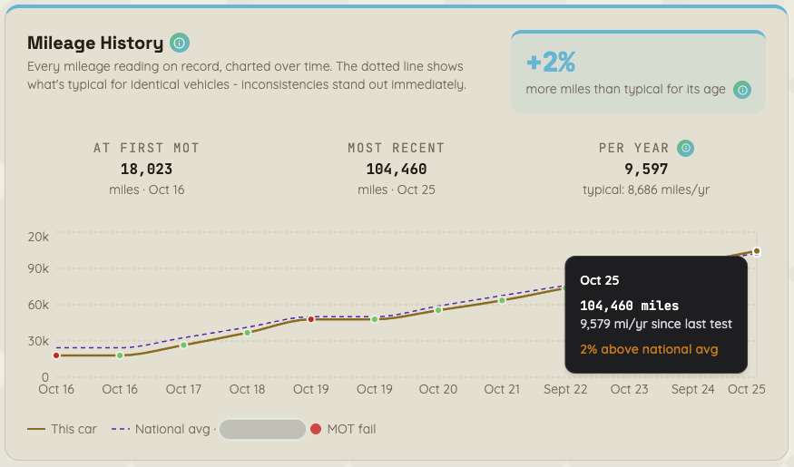
Every recorded odometer reading from this car's MOT history plotted chronologically, with the national average for this model overlaid for comparison.
The warning signs BIB looks for
Most mileage histories are unremarkable - a steady upward line, passing tests, nothing unusual. But sometimes the data tells a different story, and BIB flags it clearly.
Mileage that goes backwards
If a car shows a lower mileage at one test than it did at a previous one, that's a serious concern. Mileage can only go up - a drop means the clock has been tampered with. BIB flags this immediately.
An unusual jump between tests
If the car's mileage is steady year on year and then suddenly jumps by an implausible amount in a single year, that's worth querying with the seller. It could have a perfectly innocent explanation - but it could also be a sign of records being manipulated.
Consistently higher-than-average mileage
This isn't a red flag on its own - a high-mileage car can still be a great buy. But it means the car has covered more ground than its peers, and the wear on key components will reflect that. BIB puts a percentage next to the national average so you know exactly how it compares.
When everything lines up
A clean mileage history is genuinely reassuring. It's one less thing to worry about - and on a used car, that's worth something.